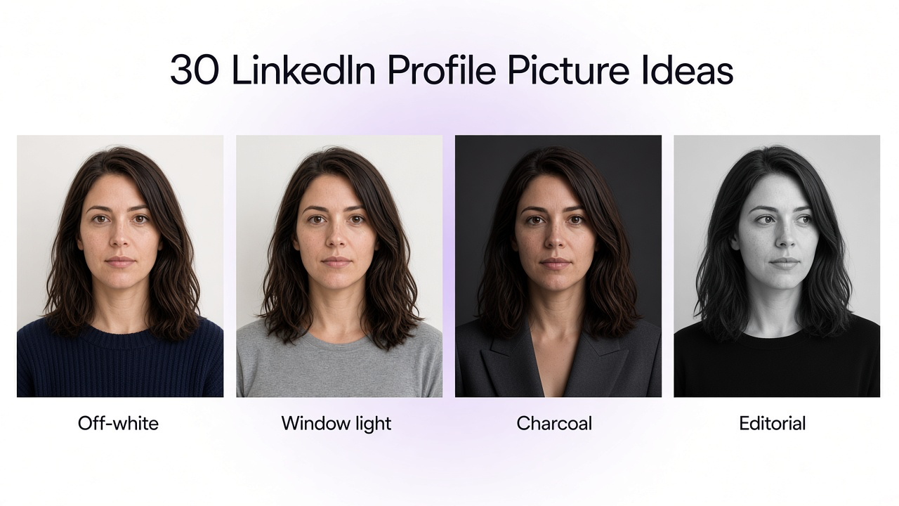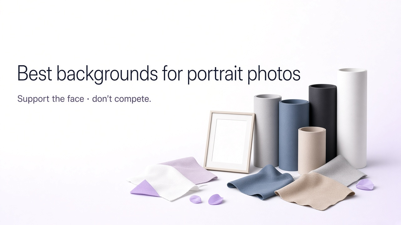
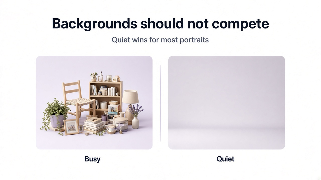
A portrait background does not need to be interesting on its own. Its job is to support the person.
Sometimes that means disappearing almost completely behind the subject. In other portraits, the background communicates profession, personality, location, or mood. A corporate headshot and an editorial fashion portrait therefore should not necessarily use the same visual approach.
The most useful way to choose a background is to start with the purpose of the portrait, then consider subject separation, clothing, lighting, and how much context the viewer actually needs.
What makes a good portrait background?
A strong portrait background does at least one of two things: it stays visually quiet enough for the person to remain dominant, or it adds context that makes the portrait more meaningful.
A good portrait background usually
Keeps attention on the face
Separates the subject clearly from the background
Works with the clothing rather than blending into it
Matches the lighting direction and softness
Fits the purpose of the portrait
Avoids distracting objects, text, logos, and awkward lines
Looks believable at the chosen depth of field
Portrait backgrounds by use case
| Portrait type | Good starting backgrounds |
|---|---|
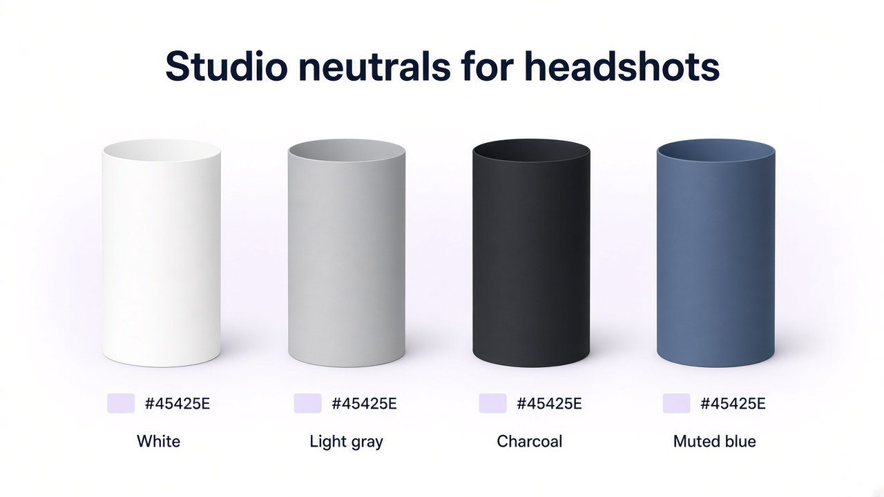
| Corporate headshot | White, light gray, charcoal, muted blue |
| LinkedIn profile | Light gray, soft office blur, neutral wall, muted blue |
| Creative professional | Textured studio, muted color, creative workspace, architecture |
| Beauty portrait | Clean neutral, soft gradient, dark studio, controlled color |
| Fashion portrait | Bold seamless color, architecture, textured wall, editorial studio |
| Casual profile | Window-lit interior, greenery, street, café, soft outdoor blur |
| Personal branding | Workspace, studio, brand-color background, relevant environment |
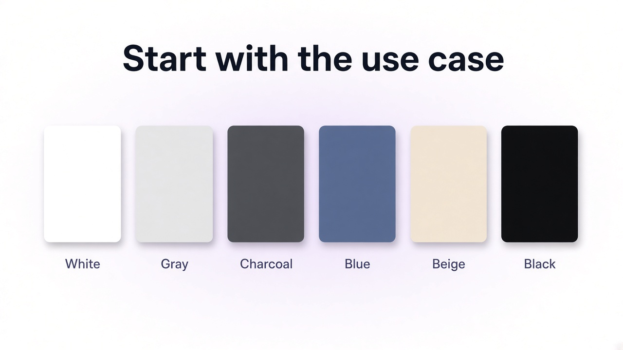
15 portrait background ideas
1. Clean white background
White is one of the safest options when the portrait needs to feel clean, straightforward, and easy to reuse.
It works particularly well for corporate directories, staff pages, speaker profiles, applications, simple LinkedIn images, and any design where the portrait may later appear beside text or other people.
The main weakness of pure white is that poor lighting can make it feel flat or make pale clothing and hair lose separation. A subtle shadow or tonal difference between subject and background can keep the portrait from looking cut out.
2. Light gray background
Light gray is one of the most flexible professional portrait backgrounds because it feels neutral without being as visually stark as pure white.
It works with many clothing colors, gives light-colored subjects more separation than white, and can fit corporate, LinkedIn, portfolio, and personal-branding portraits.
3. Charcoal gray background
Charcoal creates more contrast and visual weight than light gray while remaining professional.
It can work especially well for leadership portraits, creative professionals, consultants, founders, speakers, and portraits where you want a more deliberate studio look without moving into dramatic black.
4. Muted blue background
Blue is common in professional portraits because muted versions add color without demanding much attention.
Deep navy can feel formal, while softer slate or desaturated blue feels lighter and more contemporary. Avoid choosing blue simply because it is traditionally associated with corporate imagery; use it when it complements the subject and the context.
5. Warm neutral or soft beige background
Warm off-white, taupe, sand, and soft beige can make a portrait feel more relaxed than a standard corporate gray.
They are useful for therapists, consultants, lifestyle brands, beauty professionals, writers, coaches, designers, and personal-branding portraits where a very corporate background would feel too formal.
Keep the color restrained. Strong yellow or orange casts can affect the perceived skin tone and make the final image feel heavily graded.
6. Deep black background
Black creates a high-contrast studio portrait and can work well when you want the face and lighting to carry the entire image.
It suits editorial portraits, actors, artists, musicians, beauty photography, founders, and other subjects where a slightly more dramatic image is appropriate.
For ordinary corporate headshots, black can sometimes feel heavier than necessary. It also requires deliberate rim or edge separation when hair or clothing is dark.
7. Soft gradient background
A subtle gradient gives a clean studio portrait slightly more depth than a completely flat color.
The effect should usually be restrained: slightly lighter behind the head and shoulders, then gradually darker toward the frame edges. Strong glowing halos can quickly make the portrait look artificial.
8. Softly blurred office background
An office background gives a business portrait context without making the workspace itself the subject.
This works well for founders, executives, recruiters, sales professionals, consultants, engineers, and other people whose professional environment contributes useful meaning.
The office should remain believable but quiet. Large logos, readable screens, busy desks, glass distortions, strong ceiling lights, and obvious stock-office details can make the portrait look staged.
9. Window-lit interior
- A simple interior near a large window feels more personal and less corporate than an office while still looking intentional.
- This works well for writers, designers, coaches, creators, freelancers, therapists, and casual professional portraits.
- Use simple walls, natural daylight, restrained furniture, and enough blur that the room supports the person without becoming a home-interior photograph.
10. Creative studio or workspace
An environmental portrait can communicate profession more effectively than a generic studio backdrop when the environment is genuinely relevant.
A designer may be photographed in a minimal studio, an artist near materials, an architect in a clean workspace, or a photographer in a controlled creative environment.
The environment should add context rather than become a catalog of props.
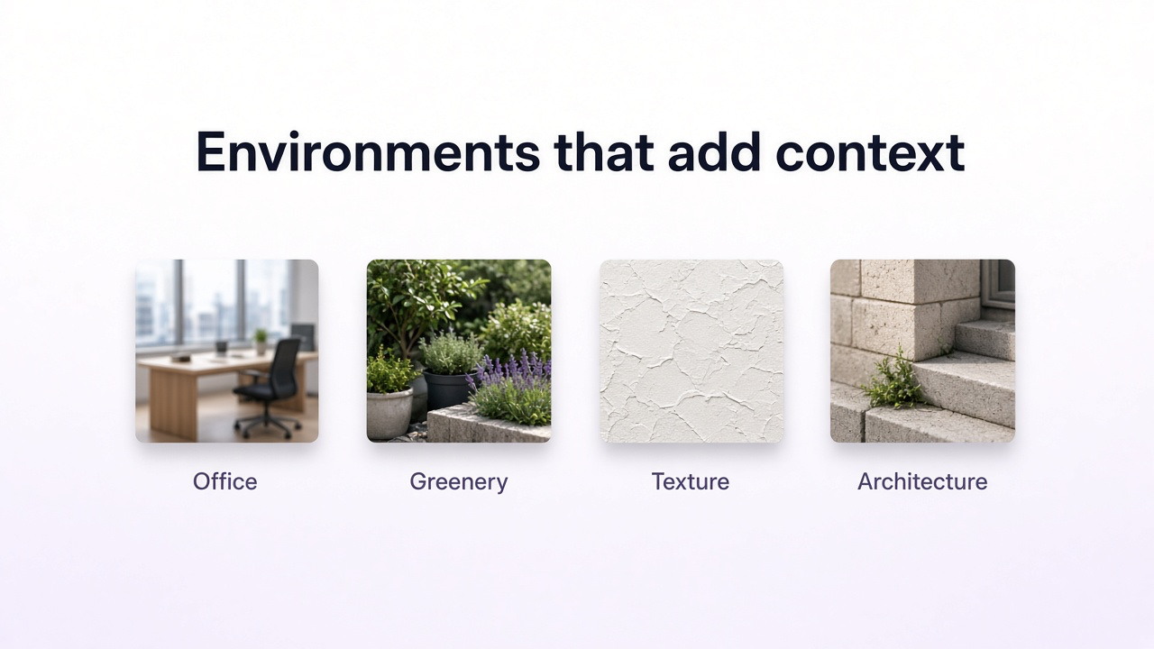
11. Soft outdoor greenery
Trees, foliage, parks, and gardens can create a relaxed portrait when the greenery is sufficiently separated from the subject.
A softly blurred green background can work well for casual profiles, lifestyle professionals, authors, wellness brands, outdoor businesses, family portraits, and personal-branding imagery.
Avoid placing the person directly against visually busy leaves. Distance between subject and background helps reduce distracting texture.
12. Urban architecture
Clean architectural backgrounds can make portraits feel contemporary without requiring an obvious office.
Stone walls, modern buildings, concrete, glass, columns, or simple streets can work for founders, architects, creatives, consultants, fashion portraits, and editorial profiles.
Watch for poles, window frames, or architectural lines appearing to grow directly out of the subject's head. Small changes in camera position can solve these problems when shooting.
13. Textured neutral wall
- A plaster, concrete, limewash, painted, or lightly textured wall adds visual character without requiring a detailed environment.
- This is a good middle ground between a completely seamless studio backdrop and a full lifestyle location.
- Keep texture scale believable. Oversized cracks, repeated AI patterns, or aggressively mottled surfaces can compete with facial detail.
14. Bold solid color
A stronger color can work well for fashion, beauty, musicians, creators, performers, personal brands, editorial profiles, and campaign portraits.
Instead of asking which color is universally flattering, look for useful separation from hair and clothing and a palette that fits the intended identity.
For example, a muted green, dusty blue, burgundy, soft pink, or restrained lavender can create more identity than neutral gray while remaining relatively easy to control.
15. Brand-color background
For teams, founders, speakers, creators, and personal brands, a restrained brand-color background can connect the portrait with the surrounding website or campaign.
The background does not need to reproduce the brand color at full saturation. A lighter, darker, or more muted version often gives better subject separation and is easier on skin tones.
If several team portraits will appear together, keep lighting, crop, background intensity, and subject scale consistent across the set.
Should a portrait background be blurred?
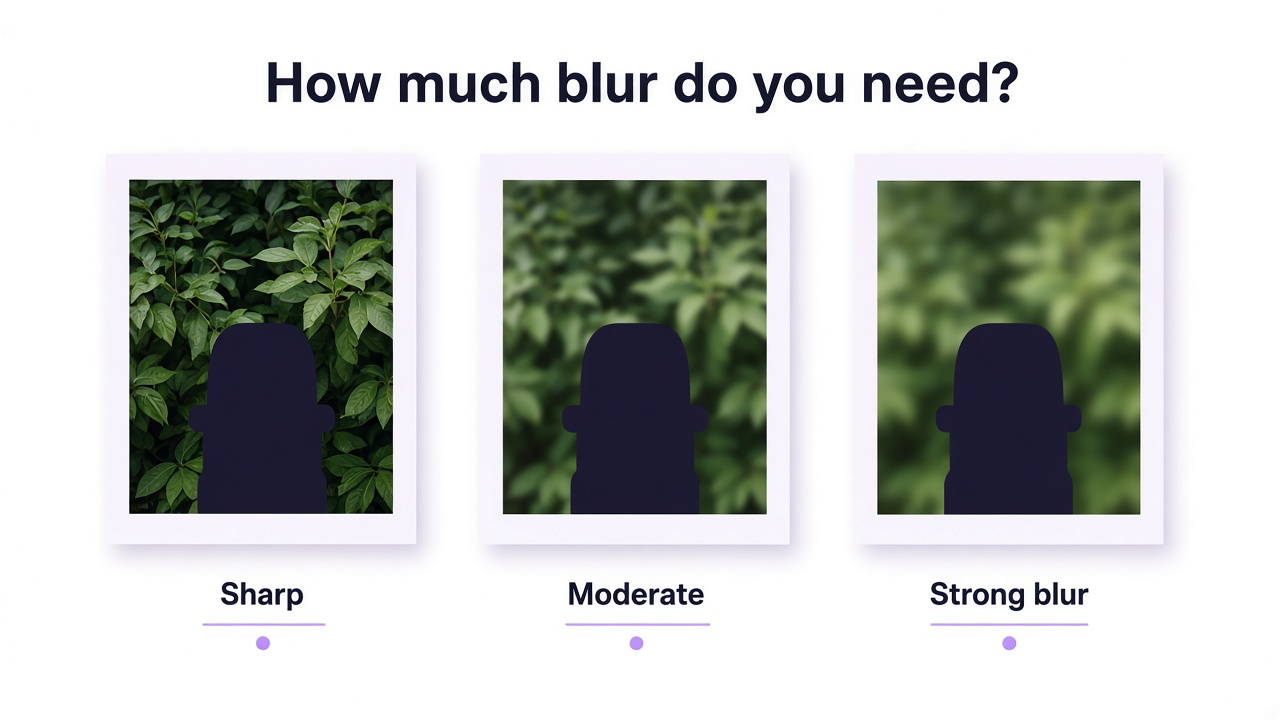
Blur is useful when the environment adds context but contains too much detail to compete equally with the person.
It is not automatically better than a sharp background. An environmental portrait may intentionally keep more detail visible when the location is part of the story.
| Background treatment | Works well when |
|---|---|
| Strong blur | The environment is useful context but the face should dominate |
| Moderate blur | You want viewers to recognize an office, street, studio, or outdoor setting |
| Mostly sharp | The environment is intentionally part of the portrait's story |
| Solid background | You want maximum simplicity and reuse |
How to choose a background color for a portrait
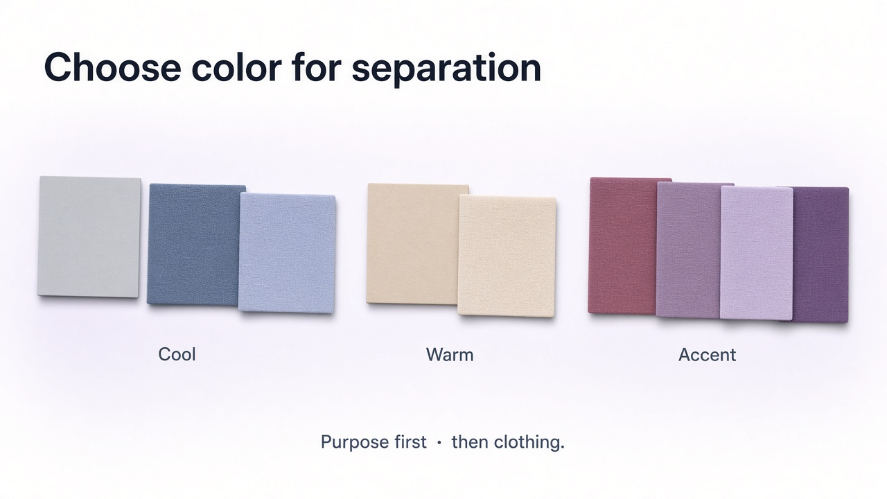
You do not need a complicated rule based on eye color or skin tone. Start with separation and purpose.
Start with the portrait's purpose
Professional, editorial, casual, beauty, creative, or personal branding.
Check clothing and hair separation
Avoid backgrounds so similar in tone that important edges disappear.
Check overall color balance
The backdrop should support natural-looking skin and should not create an unnecessary color cast.
Keep saturation appropriate
More formal portraits usually benefit from restrained color, while editorial or creative portraits can support stronger backgrounds.
Test at the final crop
A background that works in a half-body portrait may feel very different once cropped to a small profile image.
Backgrounds for professional headshots and LinkedIn
For most professional headshots, simpler is safer. The image needs to remain readable at a small profile-picture size, where detailed backgrounds become difficult to understand.
Good professional background options
Light gray
Soft white
Muted blue
Charcoal with good subject separation
Softly blurred office
Simple neutral interior
For headshot-specific options by role and platform, see Professional Headshot Background Ideas. For more complete profile-picture ideas, see LinkedIn Profile Picture Ideas and Best AI Headshot Generators.
Portrait background mistakes to avoid
- Busy objects directly behind the faceSigns, lamps, plants, shelves, and architecture can visually merge with the subject.
- Background and clothing with almost identical toneShoulders and hair can disappear into the scene.
- Fake-looking blurUniform blur around hair or unnatural depth transitions can make a replaced background obvious.
- Lighting that does not matchA brightly sunlit background behind a softly studio-lit subject can look composited.
- Incorrect perspectiveThe subject and background should feel as though they were photographed from the same camera position.
- Visible text or accidental logosUnnecessary signs and branded elements pull attention from the portrait.
- Overly dramatic environments for professional profilesThe background can become more memorable than the person.
- Changing the person while changing the backgroundAI edits should preserve identity when the background is the only intended edit.
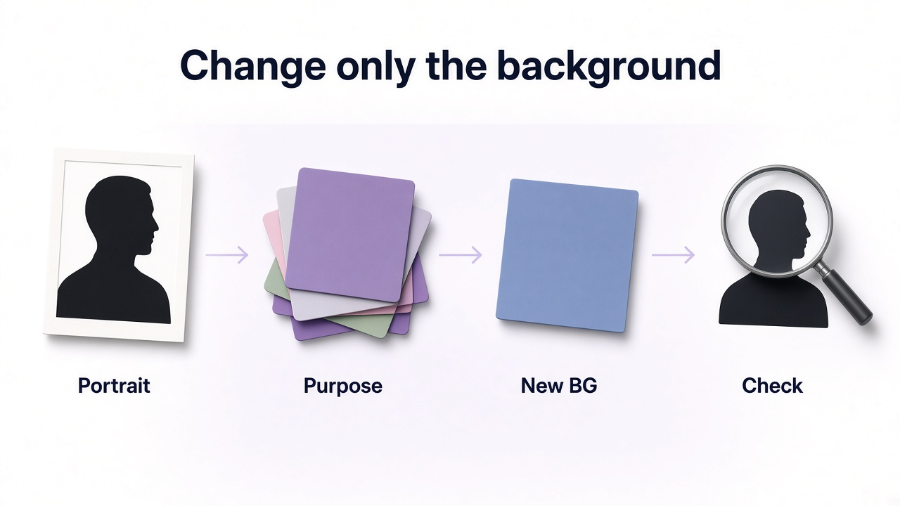
How to change a portrait background with GenImagePro
If you already like the portrait itself, you do not need to regenerate the person just to try another background.
Upload the existing portrait to GenImagePro and describe the environment you want while explicitly preserving the person. This is useful for turning one approved portrait into professional, office, outdoor, creative, or brand-specific variations.
Related reading: How to Change a Photo Background with AI.
Upload the portrait
Choose an image where the face, hair, clothing, and subject edges are clear.
Choose the purpose
Decide whether the new result is for LinkedIn, a team page, personal branding, editorial use, or another context.
Describe only the new background
Specify environment, color, depth, lighting, and how much background detail should remain visible.
Preserve the subject
Tell GenImagePro to keep identity, face, hair, expression, pose, clothing, proportions, and framing unchanged.
Check the composite
Review hair edges, lighting direction, depth of field, shadows, perspective, and skin tone.
General prompt for replacing a portrait background
Portrait background checklist
The face remains the strongest focal point
Hair and clothing separate clearly from the background
Background style matches the portrait's purpose
Lighting direction matches the subject
Color does not create an unnatural cast on the portrait
Perspective feels consistent
Blur and depth of field look believable
No distracting objects appear behind the face
No accidental text, logos, or strange generated objects appear
The portrait still works at its final crop and display size
AI background replacement did not alter identity, hair, clothing, or pose
Frequently Asked Questions
What is the best background for portrait photography?
There is no single best background. Clean white, gray, charcoal, and muted blue are dependable for professional portraits, while offices, outdoor environments, textured walls, and stronger colors can work better when context or personality is important.
What background is best for a professional headshot?
Light gray, soft white, muted blue, charcoal, and softly blurred office backgrounds are strong starting points. The best option depends on clothing, hair, company style, and how formal the portrait should feel.
What is the best background for LinkedIn photos?
Keep it relatively simple because LinkedIn profile images display at small sizes. Light gray, neutral white, muted blue, or a softly blurred professional environment usually keeps attention on the face.
Is white or gray better for a headshot?
White feels cleaner and brighter, while gray generally provides more tonal separation and is slightly more forgiving with light-colored clothing. Either can work well when properly lit.
Should portrait backgrounds be blurred?
Not necessarily. Blur is useful when the environment adds context but contains distracting detail. Keep more background detail when the location is intentionally part of the portrait's story.
What background color is most flattering for portraits?
There is no universally flattering color. Choose a background that provides useful separation from the subject's hair and clothing, fits the intended mood, and does not introduce an unwanted color cast.
Can I change the background of an existing portrait?
Yes. AI image editing can replace the background while preserving the person. Check hair edges, lighting, perspective, depth of field, and identity after the edit.
Can GenImagePro change a portrait background?
Yes. Upload your portrait to GenImagePro and describe the new background you want while instructing it to preserve the person's identity, face, hair, clothing, pose, and expression.
What backgrounds should I avoid for portraits?
Avoid distracting clutter directly behind the face, backgrounds that blend too closely with clothing or hair, mismatched lighting, unnatural blur, accidental text or logos, and environments that overpower the person.
Can I use a colored background for a professional portrait?
Yes. Muted blue, green, beige, or a restrained brand color can work well when it remains professional and provides good subject separation. Strong saturated colors are usually better suited to creative or editorial contexts.