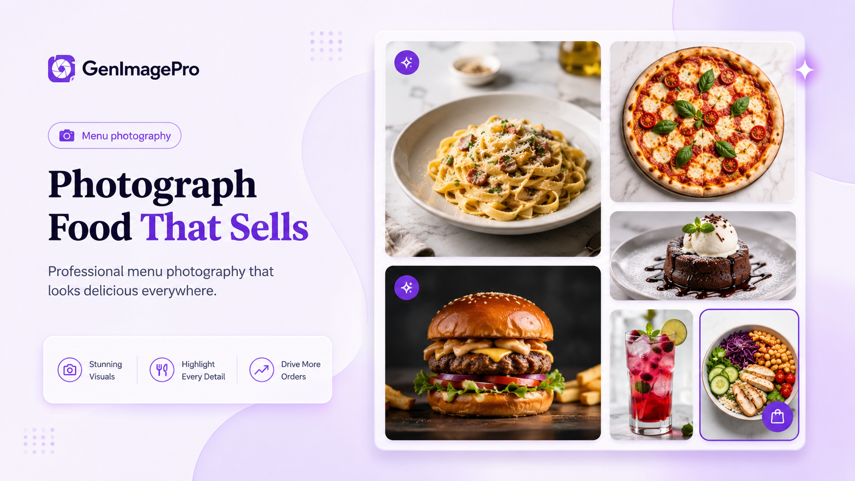
Restaurant menu photography is not only about making food look attractive. A successful menu image must also explain the dish quickly, show the correct ingredients and portion, fit the restaurant's brand, and remain clear on websites, printed menus, delivery apps, social media, and advertisements.
Customers often decide what to order before reading the full description. A clear image can communicate texture, serving size, freshness, presentation, and value within seconds. Dark, blurry, inconsistent, or misleading photos can make even a strong menu feel less trustworthy.
You do not always need an expensive studio. Good lighting, careful plating, an appropriate camera angle, clean surfaces, and a repeatable visual system usually matter more than complicated equipment.
This guide explains how to plan a menu shoot, prepare dishes, choose lighting and angles, photograph different food categories, edit responsibly, use AI without misrepresenting the food, and create consistent images across every restaurant channel.
Restaurant menu photography is the creation of food and beverage images specifically for selling menu items. Unlike editorial food photography, a menu image must help customers understand what they are ordering.
The image should show the actual dish, its main ingredients, portion, plate or container, and general presentation accurately. It can still look polished and professional, but it should not create an expectation the restaurant cannot meet.
A restaurant image library may include individual dish photos, table spreads, drinks, desserts, ingredient close-ups, delivery packaging, seasonal specials, atmosphere images, and promotional campaign visuals.
Food images influence both perception and decision-making. Bright, consistent photos can make a restaurant look more organized, established, and reliable. They also help customers compare dishes, understand unfamiliar foods, and choose faster.
Photography matters especially in digital ordering. On a delivery app or mobile menu, the image may receive more attention than the dish name or description. The food must remain understandable at thumbnail size.
A consistent visual system also strengthens branding. When the background, lighting, crop, color treatment, and plating style feel coordinated, the menu appears easier to browse and more intentional.
Plan the Shoot Before Cooking
Begin with a shot list rather than the first finished dish. List every item that requires an image and group similar items together so the setup does not change unnecessarily.
For example, photograph all burgers under one setup, all drinks under another, and all overhead dishes together. This reduces changes to the table, camera, background, and lighting.
For each menu item, record the dish name, intended platform, preferred angle, plate or package, required props, aspect ratio, and whether the composition needs space for text.
Main sellers, new dishes, visually distinctive items, and high-margin products usually deserve individual photos first. Secondary dishes can be photographed later or included in coordinated group scenes.
Build a Practical Shot List
A useful shot list can include one main menu image, one alternative angle, one detail close-up, one group image, and one promotional version for selected dishes. Not every item needs all five; the list should serve actual publishing needs.
Prepare the Dish for the Camera
Photograph food as soon as possible after preparation. Sauces dry, herbs wilt, ice melts, fried food softens, cheese loses shine, and steam disappears quickly.
Set the table, background, props, camera, and lighting before the final dish arrives. Use an empty plate or stand-in object while testing composition so the real food spends less time waiting.
Clean the plate edges and remove unintended drips, crumbs, fingerprints, or package damage. Small imperfections become distracting in close photographs.
Keep plating close to normal service. Styling should improve visibility, not create a portion or arrangement customers never receive.
Use Soft Directional Lighting
Soft directional light from the side or slightly behind the dish is one of the most reliable choices for restaurant food photography. It reveals texture, height, steam, gloss, and layers without creating harsh reflections.
A large window with indirect daylight can work well. Turn off nearby ceiling lights if they produce a different color temperature, because mixed blue and yellow light can make food colors difficult to correct.
For artificial lighting, use one large diffused source and a white reflector or foam board on the opposite side. A simple one-light setup is easier to repeat across a large menu.
Avoid Direct Flash
Direct phone flash can flatten the dish, create hard shadows, and produce bright highlights on sauces, cutlery, glasses, and packaging. Move the dish toward a window or use a diffused light source instead.
Choose the Right Camera Angle
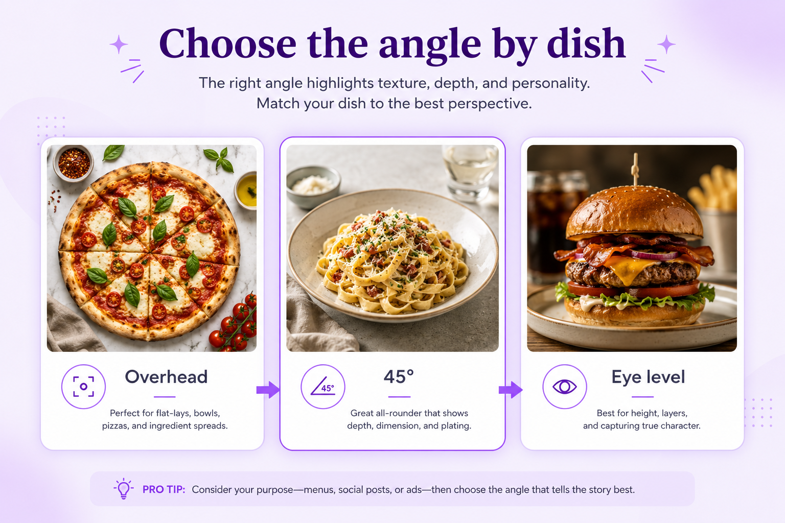
The best camera angle depends on the structure of the food. The image should reveal the characteristic that makes the dish understandable.
Overhead Angle
Overhead photography works well for pizza, flat plates, bowls, breakfast spreads, table arrangements, salads, and decorative plating. It clearly shows ingredient placement and portion layout, but it may hide the height of burgers, cakes, and layered drinks.
45-Degree Angle
A 45-degree angle resembles the way a customer sees food while sitting at a table. It works for pasta, rice dishes, soups, desserts, plated meals, and mixed menus because it shows both the top and some height.
Eye-Level Angle
Eye-level photography is useful for burgers, sandwiches, layered cakes, drinks, wraps, and stacked pancakes. Keep the lens close to the food's center so fillings, layers, and height remain visible.
Compose for Clarity
The dish should be the main visual priority. Keep backgrounds, props, hands, utensils, and decorations from competing with the food.
Use centered framing, rule of thirds, diagonal placement, repeated shapes, or controlled negative space according to the final use. A delivery thumbnail, printed menu, social post, and website banner require different compositions.
For delivery apps and small screens, crop more closely and keep the whole dish recognizable. For banners and advertisements, leave deliberate space for headings, prices, or calls to action.
Keep the Food Large Enough
A menu image should still work when reduced to a small card. If the food occupies only a small portion of the frame, customers may not understand it quickly. Avoid excessive empty space unless the image is designed for copy.
Choose Backgrounds That Match the Brand
The background should support the cuisine and restaurant identity. A modern café may use pale stone or light wood. A steakhouse may use dark timber, black surfaces, or warm neutral textures. A bakery may use cream, linen, or soft pastel surfaces.
Avoid backgrounds too similar in color to the food. A brown burger on a dark brown table may lose definition, while a lighter neutral surface creates separation.
The background family should remain consistent across menu categories. Several related surfaces can work, but they should still feel like one brand system.
Use Props Carefully
Props can provide context and scale, but they should not become more noticeable than the food. Use only items that naturally belong in the scene.
Suitable props include a folded napkin, simple cutlery, a small ingredient, a serving board, or one restrained table detail. Menu photography usually benefits from cleaner styling than editorial food photography.
Show the Real Portion
Menu photography should represent the quantity the customer receives. Do not add extra pieces, enlarge the serving, or hide the real container size.
The number of dumplings, wings, cookies, sushi pieces, or side items should stay accurate. Drinks should appear in the same cup or glass size used during service.
Accurate photography reduces disappointment and supports trust. A more dramatic image is not useful when the delivered dish looks substantially different.
Keep Ingredients Recognizable
Visible ingredients help customers understand flavor and texture. Arrange toppings, sauces, garnishes, and fillings so the main components remain clear.
For burgers and sandwiches, reveal the internal layers. For bowls and salads, avoid covering important ingredients. For pizza, distribute toppings naturally without making every section look mechanically identical.
Do not add decorative ingredients that are not served with the dish. Even small additions can create inaccurate expectations.
Burgers and Sandwiches
Use an eye-level or low three-quarter angle to show height, fillings, and texture. Keep the front edge clean and avoid pressing the sandwich too flat.
Pizza and Flat Dishes
Use overhead photography to show toppings and full shape. A slight angle can work when crust height, melted cheese, or texture matters.
Bowls, Pasta, and Plated Meals
A 45-degree angle usually shows both ingredient arrangement and depth. Use overhead views for highly graphic or symmetrical plating.
Desserts
Use soft side lighting to reveal layers, glaze, crumbs, cream, and texture. Eye level works well for cakes, while overhead works for cookies and pastry collections.
Drinks
Photograph drinks near eye level or slightly above depending on whether the top garnish or glass shape matters. Control reflections and keep condensation believable.
Delivery Packaging
Show the real container and portion clearly. Include one open-package view and one closed branded-package image when both help customers understand the order.
Consistency makes a menu easier to browse. Define a repeatable system for lighting direction, background family, camera height, crop, shadow style, color temperature, and aspect ratio.
Consistency does not mean every dish must use the same angle. A burger can remain eye level while a pizza is overhead, as long as the overall lighting and editing treatment remain coordinated.
Save successful camera positions, light placement, editing settings, and AI templates. A repeatable setup reduces production time when new dishes are added later.
Edit Food Photos Carefully
Editing should improve clarity without making food look artificial. Correct exposure, white balance, contrast, crop, perspective, and small distractions first.
Increase saturation cautiously. Natural ingredient colors are more believable than neon vegetables, extremely orange cheese, unnaturally red meat, or pure-white sauces.
Sharpen only enough to reveal texture. Excessive sharpening can make bread, meat, rice, and sauces appear dry or rough.
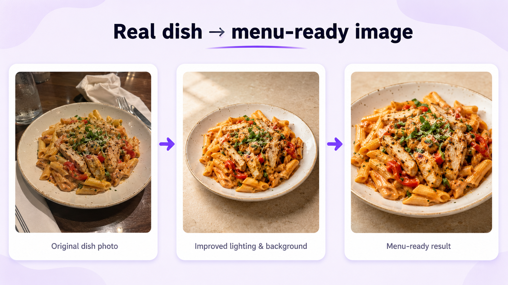
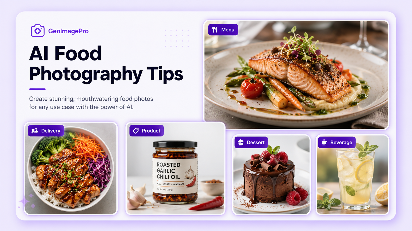
AI can help restaurants clean backgrounds, improve lighting, standardize composition, remove distractions, resize images, and create new promotional settings from real dish photos.
Start with the real food image whenever the output represents an orderable item. Ask the AI to preserve the dish, visible ingredients, portion, plating, plate or container, and arrangement.
Review every generated image for invented ingredients, duplicated food, altered quantities, incorrect packaging, broken utensils, unrealistic steam, distorted plates, and inconsistent shadows.
Create Different Versions for Each Channel
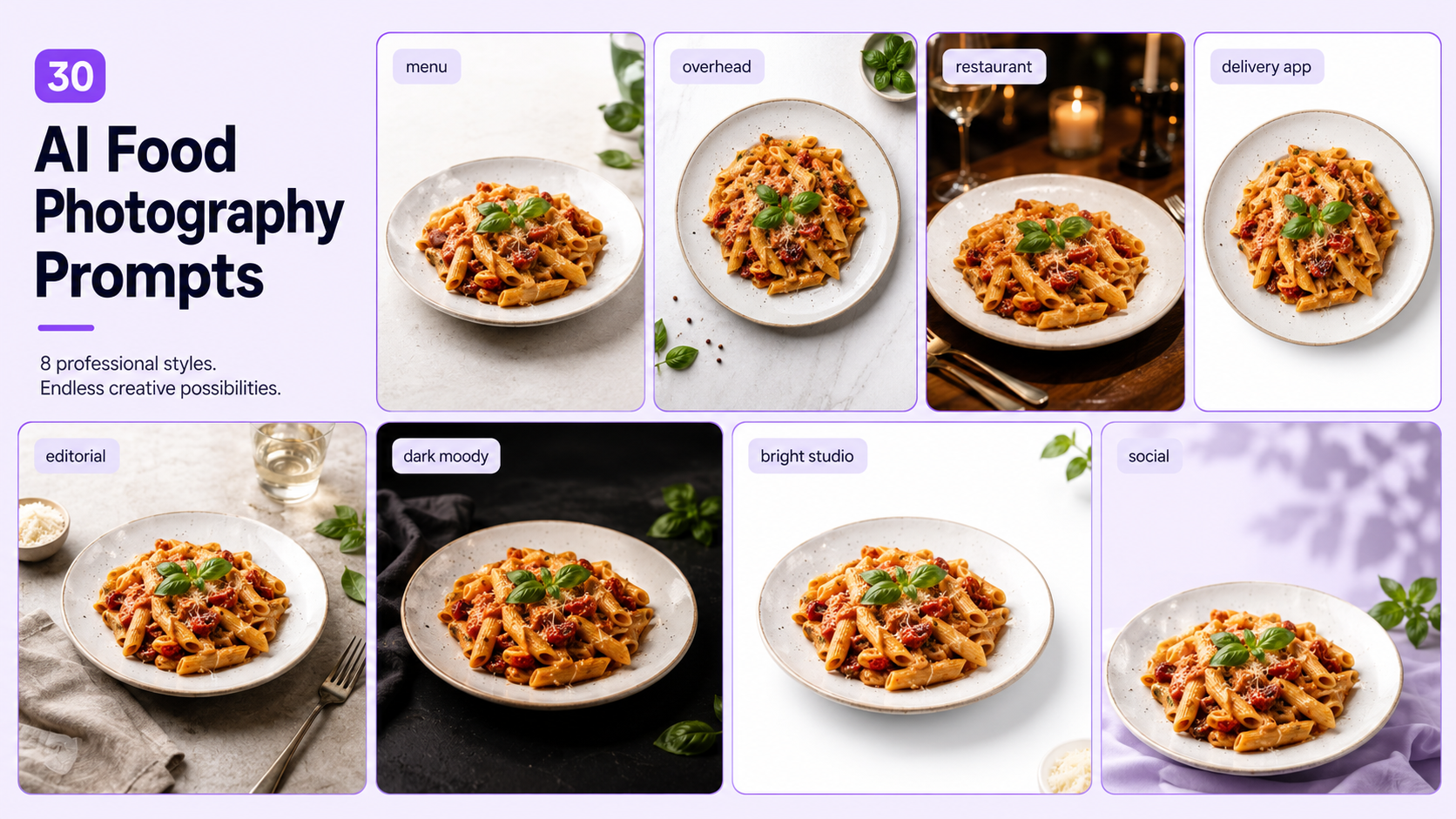
Use high-resolution images with controlled color, clear composition, and enough space for dish names, descriptions, and prices.
Restaurant Websites
Use a mix of close menu images, wide hero photographs, group scenes, and atmosphere visuals. Optimize file sizes so large photos do not slow the page unnecessarily.
Delivery Apps
Use simple backgrounds, close crops, strong thumbnail readability, and consistent square or platform-specific formatting.
Create vertical and square versions with more context, atmosphere, hands, serving moments, or campaign styling while keeping the dish recognizable.
Advertisements
Leave deliberate space for promotional text, prices, logos, and calls to action. Use stronger visual hierarchy than a standard menu image.
Photographing every dish under different lighting, backgrounds, and crops creates a disorganized menu even when the individual images are attractive.
Busy props and backgrounds can compete with the food. Menu images should communicate quickly, especially on mobile screens.
Extreme saturation, gloss, steam, contrast, or sharpening can make a dish look synthetic and less trustworthy.
Presenting a larger portion, different ingredient list, or arrangement that customers do not receive can create disappointment.
Publishing the same crop everywhere ignores the different needs of printed menus, delivery apps, websites, social posts, and advertisements.
Before publishing, confirm that the dish is sharp, properly exposed, accurately colored, and large enough in the frame.
Check that the ingredients, portion size, plate, container, number of pieces, garnishes, and packaging match the real menu item.
Confirm that the background, lighting, crop, shadow style, and editing remain consistent with the rest of the restaurant menu.
Export the image at the correct aspect ratio and resolution for its destination, then review it at the actual display size.
Final Recommendation
Strong restaurant menu photography combines accuracy with presentation. Begin with the real dish, use soft directional light, choose an angle that explains the food, keep the composition clear, and build a consistent visual system across the menu.
Use editing and AI to improve lighting, backgrounds, crops, and consistency rather than to redesign the food. Customers should receive a dish that looks recognizably similar to the image that helped them order.
Food photo enhancer tools provide templates for restaurants that want to transform existing dish photos into polished menu, delivery-app, website, advertising, and social images from one workflow.
FAQ
What is restaurant menu photography?
Restaurant menu photography is the creation of food and beverage images specifically for menus, websites, delivery apps, advertisements, and restaurant marketing.
What is the best lighting for menu photography?
Soft directional light from the side or slightly behind the food is a reliable choice because it reveals texture and shape without creating harsh reflections.
What camera angle is best for food menu photos?
Use overhead views for flat dishes and arrangements, 45-degree views for most plated meals, and eye-level views for burgers, drinks, cakes, and layered foods.
Can I take menu photos with a phone?
Yes. A modern phone can produce useful menu images when the food is sharp, the lighting is soft, the lens is clean, and the composition is controlled.
Can AI improve restaurant food photos?
Yes. AI can improve backgrounds, lighting, crops, color, image quality, and consistency while preserving the original dish as a reference.
Should menu photos show the real portion size?
Yes. The image should accurately represent the quantity, ingredients, plating, packaging, and number of pieces customers receive.
How do I make menu photos consistent?
Use a repeatable system for lighting direction, background family, camera angle, crop, shadows, color treatment, and aspect ratio.
Does GenImagePro require photography prompts?
Not always. GenImagePro uses a template-first workflow, allowing restaurants to upload a food photo and choose a ready-made visual direction.
Social Media