AI product photography fails less often as cartoonish “fake AI” art and more often as a polished photograph of the wrong item. The logo warps. A button disappears. The print rearranges. The color runs a shade warmer. At phone size it still sells—until the box arrives.
That gap has a name: product fidelity. Realism is whether light, shadows, and materials feel photographed together. Fidelity is whether shape, color, logos, text, patterns, and components still match the SKU you sell. You need both. For gallery jobs beyond QC, see product photography types for ecommerce.
1. Approving “looks real” without a fidelity pass
This is the root mistake. A scene can pass as a photograph while the product quietly regenerates. Models compress and reconstruct; they often invent what they expect rather than restore every pixel. Consumer research around AI product images also points the same way: shoppers are less upset by “AI was used” than by inaccurate representation.
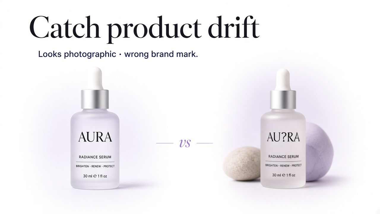
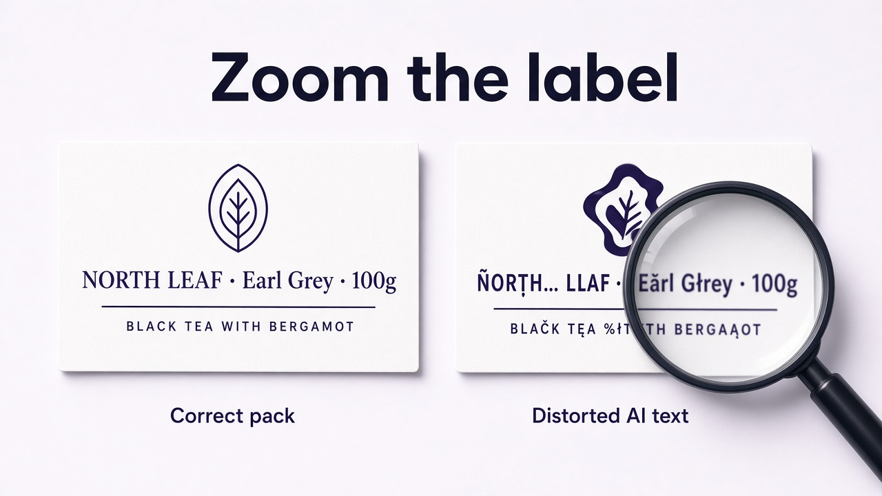
2. Logo and label text drift (the #1 fidelity failure)
Packaging text and logos are where models fail most often. Brand marks stretch, letters become gibberish, spacing breaks, or claims rewrite themselves. Cosmetics, food, supplements, and electronics are especially exposed because customers read the pack.
3. Missing, moved, or invented components
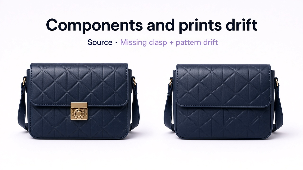
The next big cluster in fidelity tests: elements disappear, relocate, or appear from nowhere—buttons, pockets, straps, clasps, ports, stitching, embroidery, gems. Pattern and design changes sit right behind that: stripes rearrange, prints simplify, textures redraw.
Check against the source
- Hardware and closures still present and in the right place
- Seams, pockets, ports, and stitching unchanged
- Prints, weaves, and embroidery not “improved” into a different design
- No bonus zippers, logos, or accessories the SKU does not have
4. Color and finish drift
Color shifts are often subtle—warmer, cooler, glossier—but they still pick the wrong variant. Matte becoming glossy (or the reverse) is a material lie, not a lighting preference. Compare to the approved source, swatches, and other shots of the same SKU under known light.
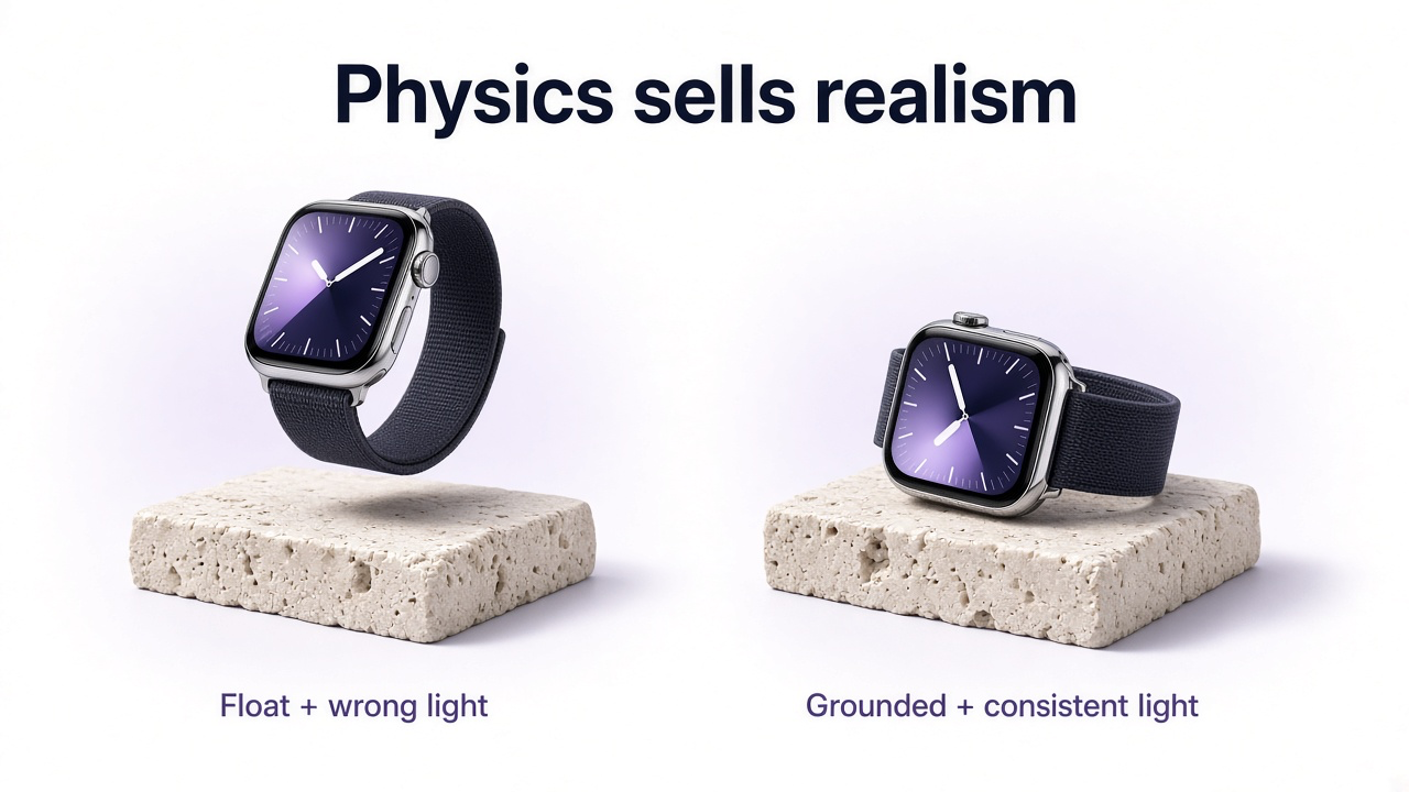
5. Physics fails: shadows, light, reflections, edges
When images look “composited,” the usual causes are physical: no contact shadow (product floats), shadow opposite the key light, soft studio product in hard sunlight, glass or metal reflecting objects that are not in the scene, or soft/haloed cutout edges from background removal—especially hair, fringe, and jewelry.
High-risk surfaces
- Glass and clear packaging — refraction and ghost reflections
- Chrome and polished metal — environment must match
- Fine edges — zoom 200% for halos and leftover background
6. Wrong scale, perspective, and implied accessories
A faithful product at the wrong size still mis-sells: bottles that read as vases, bags that dwarf a model, chairs that ignore the table. Perspective mismatch (product from above, surface at eye level) makes the item feel pasted. Props create another trap—items in frame can look included when they are not.
7. Workflow mistakes that cause the above
How bad outputs get produced
- Recreating the product from text instead of uploading a clear packshot
- Describing the product in the prompt (the model already has it)—describe light, surface, and environment instead
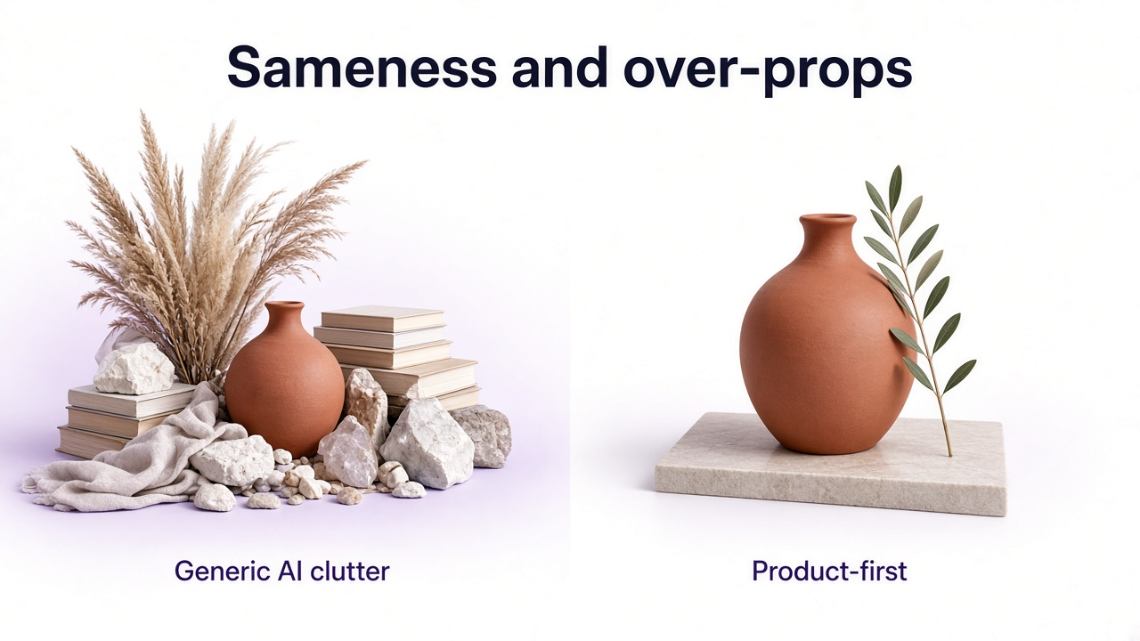
- Vague prompts (“luxurious,” “premium”) that default to generic AI staging
- Changing angle, pose, room, light, and props in one generation
- Regenerating the whole image when only a logo or button is wrong
- Using the same beige pedestal / botanical shadow on every SKU (catalog sameness)
- Replacing the white marketplace main with a lifestyle campaign frame
- Skipping QA at full zoom and at the actual display size
Channel rules still apply. Amazon mains and Google Merchant images need accurate product representation; stylized AI frames belong in secondary and ads slots. Details: prepare product images for multiple marketplaces.
A safer GenImagePro workflow
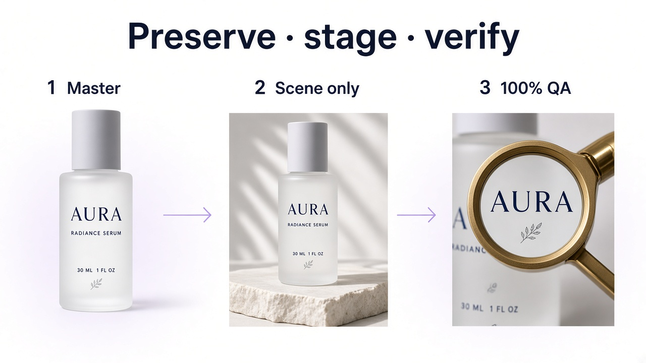
Preserve the SKU, then stage
Upload a sharp product master
Shape, labels, materials, and hardware readable—not a tiny social crop.
Prompt the scene, not the product
Surface, light direction/quality, camera height, negative space, restrained props.
Lock fidelity explicitly
Shape, color, logos, typography, pattern, components—must not change.
Fix locally when one detail fails
Prefer correcting a logo or button over re-rolling the whole lifestyle.
QA realism, then fidelity
Shadows/edges/reflections first; then side-by-side with the source at 100%.
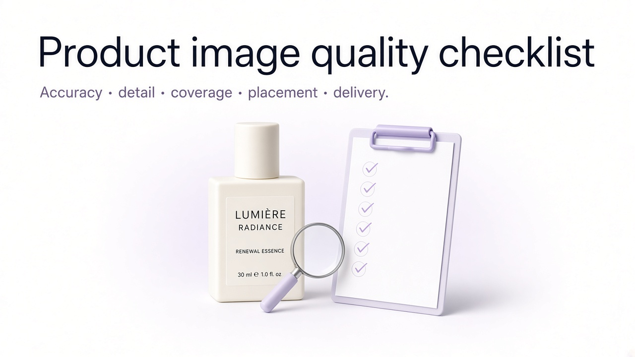
Fidelity checklist before publish
Logo identical; every label character readable and correct
No missing, moved, or invented components
Pattern, print, and embroidery match the source
Color and finish (matte/gloss) match the SKU
Silhouette and proportions unchanged
Scale vs props/people is believable
Contact shadow and light direction match the scene
Glass/metal reflections and cutout edges look clean
Props do not imply included accessories
Image role fits the channel (main vs lifestyle vs ad)
Frequently Asked Questions
What is the most common AI product photography mistake?
Shipping a photoreal image without checking product fidelity. In published fidelity benchmarks of leading editing models, logo and text distortion is the single most frequent failure—followed by missing elements, pattern changes, and color shifts.
What is product fidelity?
How accurately the result preserves the real SKU’s shape, proportions, colors, materials, logos, text, patterns, and components—not just whether the photo looks polished.
Why do AI product photos look fake?
Usually physics: mismatched light, missing or wrong contact shadows, bad scale/perspective, plastic materials, broken reflections, or soft cutout edges. Separately, the product itself may have changed even when the scene looks fine.
Should I describe my product in the prompt?
If you uploaded the product, describe the environment and light. Re-describing the product invites the model to redesign it.
Should lifestyle AI replace my white packshot main?
No for most marketplaces and catalog grids. Keep a clean, accurate product-first main; use AI lifestyle as supporting imagery.
Can GenImagePro help avoid these mistakes?
Upload a clear product master, ask for scene and lighting changes while locking design and labels, then inspect logos, hardware, and color at full zoom before you publish.
Can I use AI product images on marketplaces?
Often yes if the image accurately represents the item and follows that channel’s current image and AI-content rules. Accuracy is the hard requirement—not the tool you used.