Most image QA stops at the wrong question. Teams ask whether the file is large, the background is white, and the photo looks professional. Shoppers ask something else: What am I buying? How big is it? What is the fabric like? Does this green match the swatch I clicked? Is the charger in the box or just in the photo?
That is why a technically sharp image can still be a bad ecommerce image. If the gallery cannot stand in for picking the product up, quality failed—even if lighting is beautiful.
Run this before a launch, a supplier photo import, an AI edit, a catalog refresh, or a marketplace feed push. For failure patterns shoppers feel first, see product image mistakes that hurt sales. For generative drift, see common AI product photography mistakes.
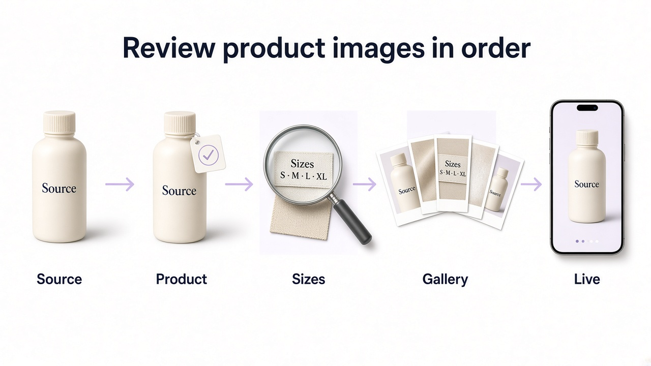
How to run the review
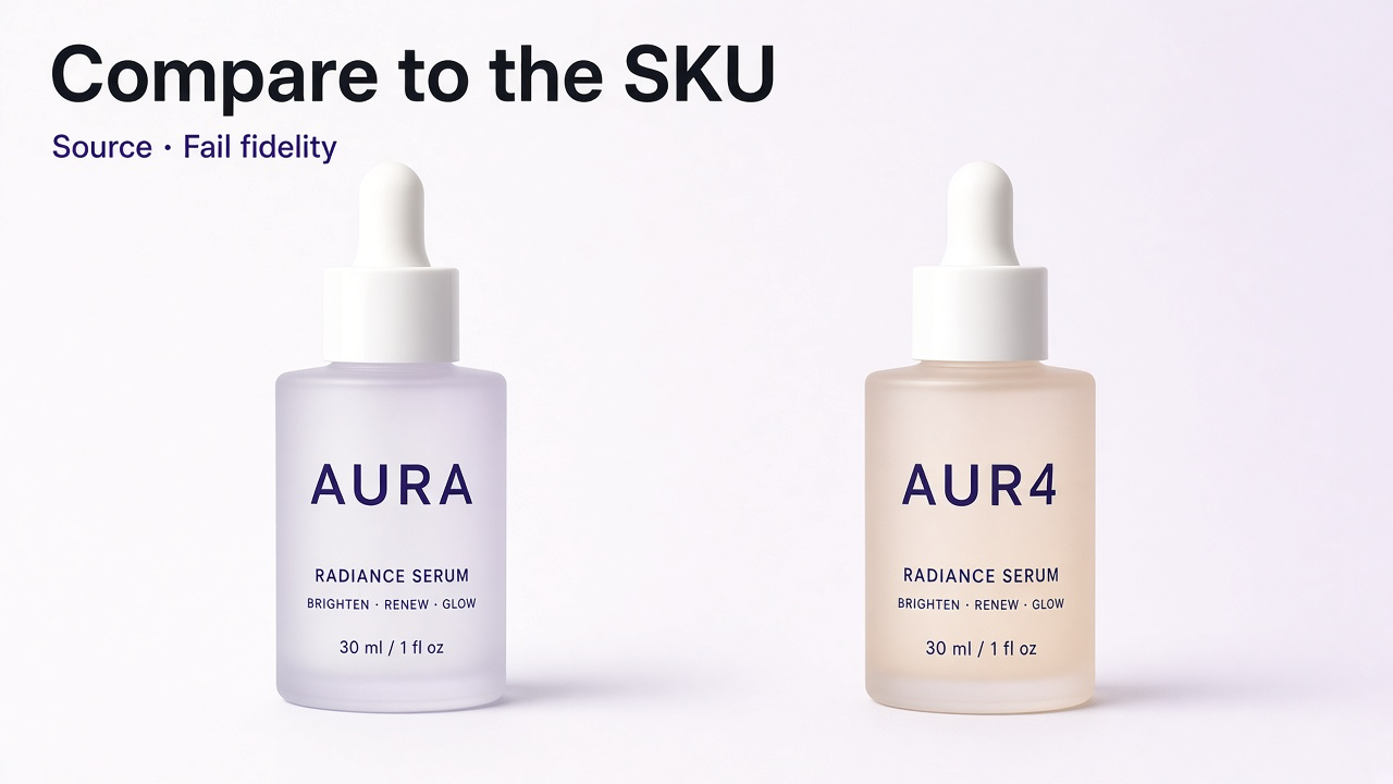
Do not open Photoshop and “eyeball” the export. Keep the approved source beside the candidate, then review the way a shopper will meet the image.
Put the source beside the candidate
Approved packshot, physical sample, or variant swatch. If you only compare AI versions to each other, shared errors look normal.
Ask the product questions first
Color, shape, labels, hardware, materials, what’s included. Reject factual errors before you discuss style.
Inspect at real sizes
Normal PDP size, zoom (or pinch), then a tiny thumbnail. Mobile-optimized files need a higher-res fetch on zoom or the gesture is useless.
Review the gallery as a set
Do the frames answer different questions, or are they seven three-quarter angles?
Check placements and the live page
Category card, mobile crop, variant switcher, then the published PDP after CDN/theme processing.
Product accuracy
Start here every time—especially after retouching, background replacement, supplier cleanup, or AI. The image can look photographic while the bottle is taller, the logo is gibberish, the clasp is gone, or Sage Green drifted toward olive.
Google Merchant Center’s product-image rules put the same idea in compliance language: the image must accurately display the product being sold, and variant imagery should reflect the correct color, pattern, finish, and material—not one generic hero reused across options.
What to compare against the source
Silhouette and proportions match the approved source
Color matches the physical variant (not “prettier”)
Materials and finish are honest (matte stays matte; leather still has grain)
Logo shape/placement and label characters are correct when zoomed
Patterns, stitching, hardware, caps, legs, ports, and packaging match
Nothing was added, removed, enlarged, or “simplified” for aesthetics
Zoom and inspectability
People zoom for a reason: SPF on a tube, stitching on a bag, wood grain on a table, a jewelry setting. Baymard’s research on image resolution and zoom has found that about a quarter of sites still fail to give sufficient resolution or zoom for visual evaluation—even on popular products. Low-res or shallow zoom does not just look cheap; it blocks the inspection shoppers came to do.
On mobile the trap is subtler. Many sites correctly serve lighter images for page weight, then forget to fetch a higher-resolution file when the shopper pinches or double-taps. Gesture support without real detail is theater.
What to verify
Looks sharp at normal PDP size
Zoom/pinch reveals useful detail—not enlarged compression mush
Fabric, leather, wood, glass, metal, and packaging type stay readable
No crunchy over-sharpening halos or “fake texture”
Source is not a screenshot or thrice-recompressed social download when a better original exists
Edges are clean: no cutout halos, leftover background, or missing transparent/reflective bits
Light direction, contact shadow, and reflections agree with the scene
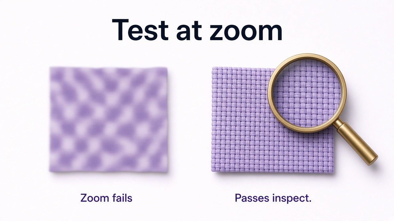
If the master is simply too small, stretching it is not the same as recovering detail. See how to increase image resolution.
Gallery coverage
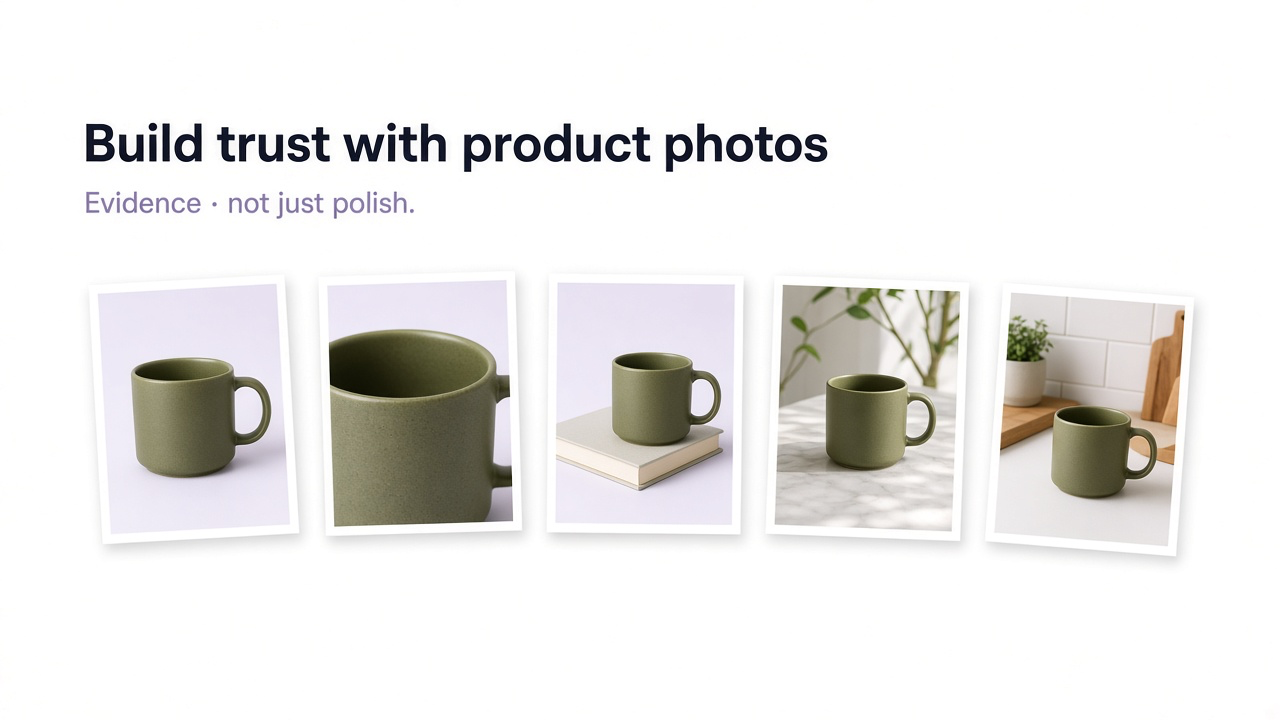
A single excellent hero is not a quality system. Quality applies to the set. Baymard’s product-page work treats image types as jobs because shoppers use pictures to answer different questions. Six near-identical three-quarter views can be “high resolution” and still leave the customer stuck.
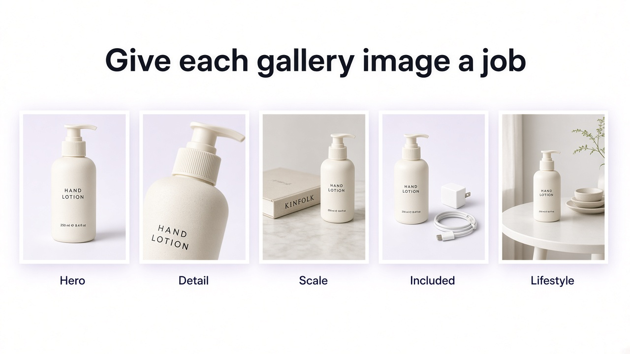
| Shopper needs | Useful image | Why it fails when missing |
|---|---|---|
| What exactly is it? | Clear product-first hero | Identity is fuzzy in grids and ads |
| Other sides / interior | Useful alternate angles | Hidden construction or fit issues |
| Material / craft | Detail close-up | Price feels unjustified; texture surprises |
| How big? | In-scale image | Wrong mental size → returns |
| What ships? | Included-accessories image | Under/overestimated value; support tickets |
| How is it used / worn? | Lifestyle or human context | Hard to imagine ownership |
Scale
Baymard found that 42% of users in testing tried to grasp size through product images—and that a large share of major sites still omit any in-scale frame even on best sellers. Spec sheets help; a hand, worn bag, or familiar object is faster.
What’s included
Shoppers often infer features from the gallery. Baymard’s benchmarking has found roughly three in ten relevant sites missing an included-accessories image in the main gallery—and testing where people miss that a mixer includes premium attachments when those parts never appear together. The reverse error is equally bad: lifestyle props that look like free gifts.
Discoverability
An included-items or scale shot buried behind ambiguous dots might as well not exist. Baymard’s gallery research favors informative thumbnails over dots so shoppers can see that more views exist—and what those views are. On mobile, many sites still skip thumbnails entirely.
For a fuller shot list by type, see product photography types for ecommerce.
Thumbnails, mobile, and shopping feeds
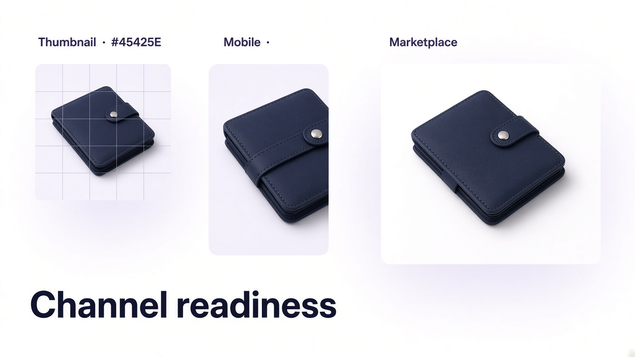
Editor full-screen is flattering. Category cards, recommendation modules, Google Shopping, Amazon search, and Etsy thumbs are not. Shrink the hero. If the product disappears into props, merges with the background, or only makes sense at full size, the main image failed QA.
Google’s merchant image guidance recommends the product occupy roughly 75–90% of the frame for shopping surfaces, accurate representation of the item, and no promo text, watermarks, or borders on the main image. Lifestyle and staging belong in additional images. Minimum pixel rules for feeds are compliance floors—not your internal master standard. Keep a larger original; export for the destination. Channel workflow: prepare product images for multiple marketplaces.
Placement checks
Immediately recognizable at thumbnail size
Enough crop-safe space if the platform crops differently
Mobile: product not chopped; swipe/zoom obvious; feature graphics still readable
Selecting a variant updates the right imagery (color, pattern, finish, hardware)
Main image meets destination rules; campaign art stays in secondary/ads slots
Color, consistency, and honest edits
Judge color as a system. One SKU should not look cool gray in the hero, warm beige in lifestyle, and chalky in the close-up unless that is true lighting behavior. Swatches must match the gallery. Over-grading that makes furniture or apparel “pop” is how you earn returns.
Consistency across the catalog is also quality: similar aspect ratios, comparable product fill in category thumbnails, and coherent editing intensity so shoppers can compare items. That is not the same as forcing every SKU onto the identical AI pedestal.
Normal edits—crop, exposure, dust, background cleanup—are fine. Edits that change what the customer will receive are not: recolored finishes, erased texture, hidden wear, upgraded materials, rewritten labels, stretched proportions.
AI-edited images
AI does not get a softer standard. It gets an extra step: side-by-side with the approved source. Do not only pick the “best looking” generation among siblings—shared drift can sit in all of them.
Shape, proportions, and components unchanged
Logos and package text still correct at 100%
Patterns and materials did not “improve” into a different design
Color still represents the SKU
Scale vs people/furniture/props is believable
Shadows, reflections, and perspective are physically coherent
Props do not invent included accessories
Generative-AI metadata retained where shopping feeds require it
Delivery, alt text, and the live page
Quality is also what arrives in the browser. Keep a high-resolution master; serve responsive sizes. Crushing every label into mush for a smaller WebP is not “optimization.” Forcing the entire gallery at full resolution before first paint is not “quality.” Prioritize the hero; load the rest as needed. Practical file guidance: product image optimization guide.
Alt text is part of quality for people who cannot see the image. Describe the useful view—“Oak dining chair beside a dining table for scale”—not a keyword pile. Decorative fillers should follow your accessibility rules for decorative images.
Then open the live listing. Themes, CDNs, and marketplaces resize, crop, and cache. Confirm desktop and phone, category thumbs, zoom, every visual variant, and the feed version. The customer’s image is the published one—not your export.
Pre-publish checklist
SKU and variant match the source (color, labels, materials, components)
Zoom shows real detail; hero still reads as a thumbnail
Gallery answers size, materials, and what’s included—not duplicate angles
Mobile, variant switcher, and destination/main-image rules pass
Live page checked on desktop and phone
When a check fails
A checklist earns its keep when it tells you what to make next. Missing scale → create an in-scale scene. Ambiguous contents → shoot or generate a clear included-items layout. Weak hero → cleaner product-first frame. Cluttered lifestyle → simplify.
With GenImagePro, upload the approved product master and ask only for the failed item—new environment, scale context, cleaner commercial composition—while locking shape, color, labels, and hardware. Then run the new file through the same checklist and the live page.
Name the failed check
Be specific: “no scale,” “label unreadable on zoom,” “Sage gallery shows Beige.”
Upload the best source
Never start from a marketplace download if you still have the original.
Generate only that fix
Preserve the product; change presentation.
Re-check source, zoom, thumbnail, and live
Approve only when those pass.
Frequently Asked Questions
What should I check before publishing ecommerce product images?
Whether the image still shows the real SKU and variant; whether zoom and detail work; whether the gallery covers size, materials, and contents; whether thumbnails, mobile, and feeds behave; and whether the live page matches what you approved.
What makes a product image “high quality” in ecommerce?
Accuracy plus usefulness. Shoppers must be able to evaluate the product—not only admire the lighting. Delivery should stay sharp without dumping unnecessary megabytes on every visit.
How many images should each product have?
Enough different views to answer the important visual questions for that SKU. There is no magic number. Redundant angles do not count as coverage.
Why do so many sites still fail image QA?
Common gaps in large-scale UX research include insufficient zoom detail, missing in-scale images, unclear included accessories, and galleries where extra images exist but are hard to discover—especially on mobile.
Should each variant have its own photos?
When the difference is visual—color, pattern, material, finish, hardware—yes. Reusing one hero across variants creates avoidable doubt.
How do I QA AI product images?
Compare every candidate to the approved source at 100%. Check labels, components, color, patterns, scale, and scene physics. Do not only pick a winner among AI variants.
Can GenImagePro help when something fails the checklist?
Yes. Upload the product, create the specific missing or weak asset, then re-run product truth, zoom, thumbnail, and live-page checks before publishing.