Online, images stand in for picking the product up. Shoppers use them for materials, size, color, construction, what’s in the box, and whether the price feels justified. Baymard’s testing has found a majority of users start exploring a product page by looking at the images—so the gallery is often the first chance to answer questions or create new ones.
Ask: what does this image help the customer understand? For a full shot list by type, see product photography types for ecommerce. For how missing jobs affect conversion, see how product images affect conversion.
Zoom fails when it matters
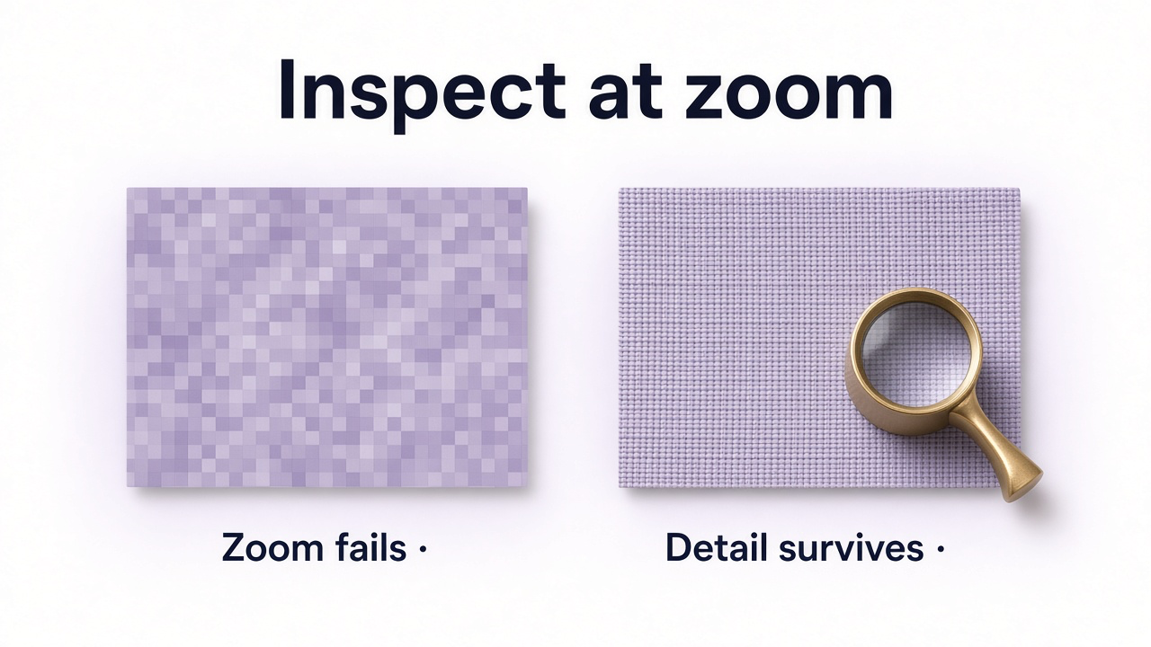
A product can look fine at default gallery size and fall apart on zoom: pixelated fabric, unreadable labels, mushy hardware. Baymard has reported a meaningful share of sites with insufficient resolution or zoom for visual evaluation—and low detail can push shoppers off otherwise relevant products.
Many images, same information
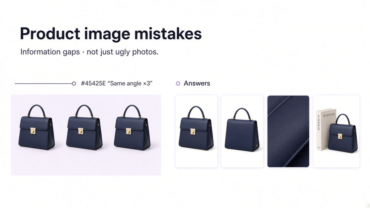
Seven near-identical three-quarter views still leave size, back, material, and contents unanswered. Count open questions, not file count. A simple SKU may need a few frames; a sofa, bag, or appliance usually needs more distinct jobs.
| Image | Question |
|---|---|
| Hero | What exactly is it? |
| Alternate angle | Back / profile / interior? |
| Detail | Material / construction? |
| Scale | How big is it? |
| Usage / on-body | How is it used or worn? |
| Included items | What arrives? |
No scale—and dimensions without a diagram
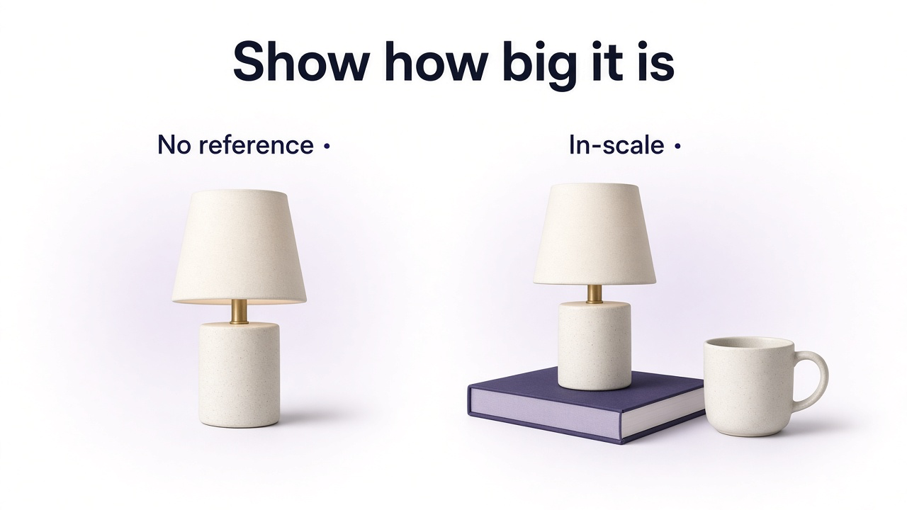
Written sizes are slow. Baymard has found a large share of users try to judge size from images; without an in-scale frame, people misjudge or leave rather than translate centimeters into a mental picture. A hand, worn bag, lamp beside furniture, or familiar desk object is often enough.
For furniture and fit-sensitive goods, a second trap is listing width/depth/height without showing where each measurement starts. Baymard’s furniture research has flagged that shoppers struggle to map specs to parts—annotated dimension visuals help. Keep accessible text specs too.
Wearables without human context—or with context that hides the product
Packshots are great for inspection. Apparel, bags, watches, jewelry, and many beauty items still need body context for length, drape, and placement. The reverse mistake: styling that hides the info—rolled sleeves covering length, hair covering earrings, a dramatic bag pose that obscures size.
What’s included is ambiguous
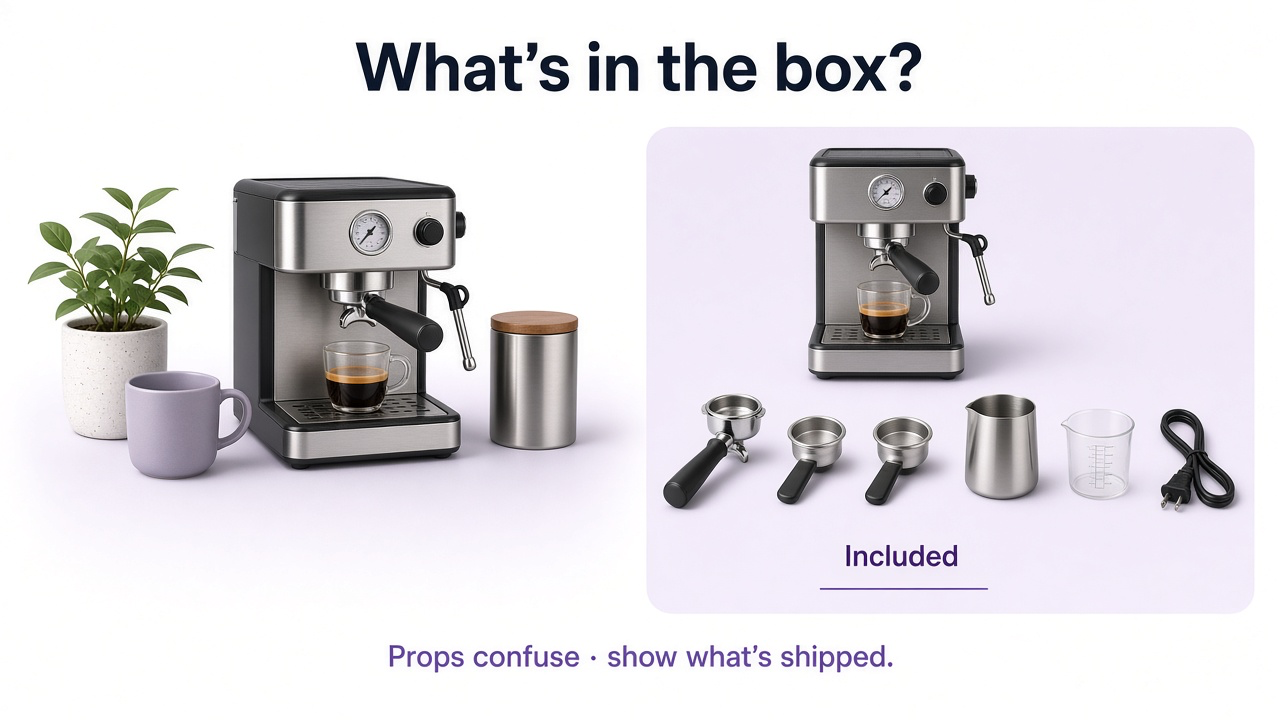
Lifestyle props and bundles create the same question: what ships? Baymard’s testing has shown customers missing included accessories when there’s no clear what’s-in-the-box image. The other failure is showing chargers, stands, cases, or plants that look included when they’re not. Shoot the main product with everything included; mark optional extras clearly.
Gallery doesn’t match the selected variant
Shopper picks Sage / Walnut / Large—hero still shows the default. Google Merchant Center recommends imagery that reflects the exact color, pattern, finish, and material being sold. When a visual trait changes between SKUs, the gallery should update with it.
Editing (or AI) makes it prettier but less true
Warm grading that turns cool gray into beige, smoothing that removes leather grain, retouching that erases seams—presentation that redesigns the SKU. Generative scenes have the same risk: photoreal and wrong. Review common AI product photography mistakes for a fidelity checklist.
Customers meet products as tiny cards in grids, Shopping, ads, and marketplaces. Elegant full-size compositions can vanish at ~150px: product too small, low contrast, edge-cropped, or buried in styling. Google’s merchant guidance favors the product filling most of the frame; Etsy stresses crop-safe space. More on channel crops: prepare product images for multiple marketplaces.

Order is merchandising. Baymard’s gallery research has found that when extra thumbnails are hidden without a clear signal, some users never discover dimensions, materials, or included-items shots. Put information-rich frames early enough to be found.
Lifestyle that buries the product—or images that slow the page
Lifestyle earns its slot for use, scale, and context. It fails when the room wins: chair lost in a huge interior, skincare drowned in props, bag angles that distort size. Clean frames for inspection; context when it adds a real answer—not because “lifestyle converts more” as a universal rule.
Keep high-res masters, but serve responsive sizes. Oversized galleries hurt LCP and patience. Prioritize above-the-fold delivery; don’t force every full-res frame on first paint. See the product image optimization guide.
Fill the gap, don’t generate random variants
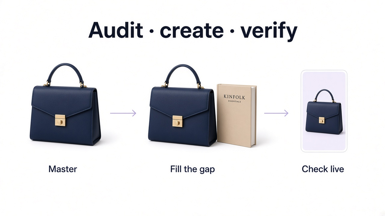
Audit by customer question, then create only what’s missing. With GenImagePro, upload a true master and build a scale scene, cleaner product-first crop, or channel composition—then verify shape, color, labels, and hardware against the source.
Practical gap-fill
List unanswered questions
Size, back, material, contents, variant, thumbnail clarity.
Upload the best master
Sharp, complete product—not a compressed social crop.
Generate the missing job
In-scale lifestyle, detail-friendly crop, or channel hero—fidelity locked.
Check live placement
Zoom, mobile card, gallery order, and page weight.
Before you publish
Hero reads at thumbnail size
Zoom shows useful detail
Each gallery frame adds information
Scale (and dimensions, if fit-sensitive) are clear
Wearables have useful human context when needed
Included vs optional items are obvious
Gallery matches the selected variant
Edits/AI still match the real SKU
Important shots are discoverable early
Lifestyle supports the product; files are optimized for delivery
Frequently Asked Questions
What product image mistakes hurt sales most?
Ones that leave uncertainty: weak zoom, repetitive angles, missing scale, unclear contents, wrong variants, over-edited colors, weak thumbnails, and hidden gallery shots that hold the answers.
How many product images do I need?
Enough to answer the important visual questions for that SKU—not a fixed number. Skip near-duplicates.
Why are in-scale images important?
Many shoppers judge size from photos. Familiar references are faster than translating a spec table.
Should every variant have its own images?
When the change is visual (color, pattern, material, finish, hardware), yes—the gallery should reflect the selection.
Are lifestyle images better than white packshots?
They do different jobs. Product-first for inspection; lifestyle for context and scale. Most stores need both.
Can GenImagePro fill missing gallery images?
Yes. Upload a real product master and create the missing job—scale, lifestyle, or channel crop—then verify fidelity before publishing.